Designing the best experience for new NYU Skirball Users
Methods: Moderated remote user testing
Client: NYU Skirball
Timeline: 6 weeks, October - December 2025
Team: Elizabeth Serjantov, Mariel Go, Madison Magnani, Liwei Jiang
Tools: Panelfox, Google Docs, Google Slides, Zoom
What is NYU Skirball?
The NYU Skirball Center for the Performing Arts is NYU's premier venue for performances, hosting innovative dance, theater, music, and film that connect students, artists, and the public.
-
You, a new user, visits NYU Skirball’s website to see what live shows they offer/will offer.
-
Purchase a ticket for an upcoming live performance.
-
Locate where you would find information about the membership(s) and what they offer you.
-
Locate where you can donate, and what options are available.
Problem & Goal
Evaluate and improve how new users on the NYU Skirball site are able to effectively perform tasks and understand important aspects, like checking out, membership, and donation options.
Timeline:
Define Problem, Understand Goals → Design Interview Protocol → Conduct Interviews → Findings & Recommendations
My Contributions
As a team, we all contributed equally to the user experience design process: empathize and define, ideation, testing, iteration, and finally implementation.
I contributed to conducting two moderated remote user interviews, and providing two recommendations and solutions to our client.
Methodology
User testing helps identify problems, uncover opportunities for improvement, and learn about the target user’s behavior and preferences. We specifically conducted remote, moderated user testing due to its benefits, including the ability to adapt the script as needed, ask for clarification, and test efficiently. It is only intensive to create the test plan, recruit participants, and set up the software needed.
Interview Format: Remote interview over Zoom, recruit 8 participants using screener questions using private panels.
-
Get information from participants regarding their live performance watching and spending habits.
-
Have participants complete 3 tasks on website and answer questions after.
-
Get participants’ overall thoughts on website and experience.
-
Gather insights, complete competitive analysis, and formulate recommendations.
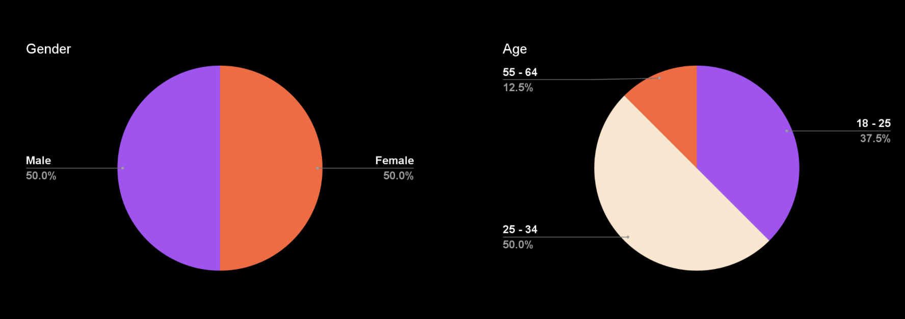
Our Participants: Demographics
Occupations:
UX Designer (2), freelance artist, university chairperson, bakery assistant, magazine editor, technical manager, unemployed
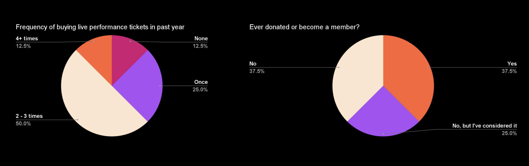
Reasons for donating/becoming a member:
Helping others
Supporting and restoring art I care about
Helping younger generations with education
High quality services
Frequently updated benefits
User Scenario & Tasks
Participant Quote: “The visuals are really cool. They make NYU Skirball look reputable and really high quality.”
Overall, users liked the site & experience:
62.5 % found the tasks to be easy
87.5 % would recommend to a friend
62.5 % complimented the overall site design
However,
50% couldn’t understand some of the content
62.5 % struggled with navigation
62.5 % found the ticketing flow confusing or annoying
Overall Findings & Recommendations
Recommendation 1: Restructure membership tier information
“It’s hard for me to choose, I know I saw the membership levels on the previous page, but I can’t remember them.”
Problem
Due to user confusion with the memberships we separated them into two categories to simplify them.
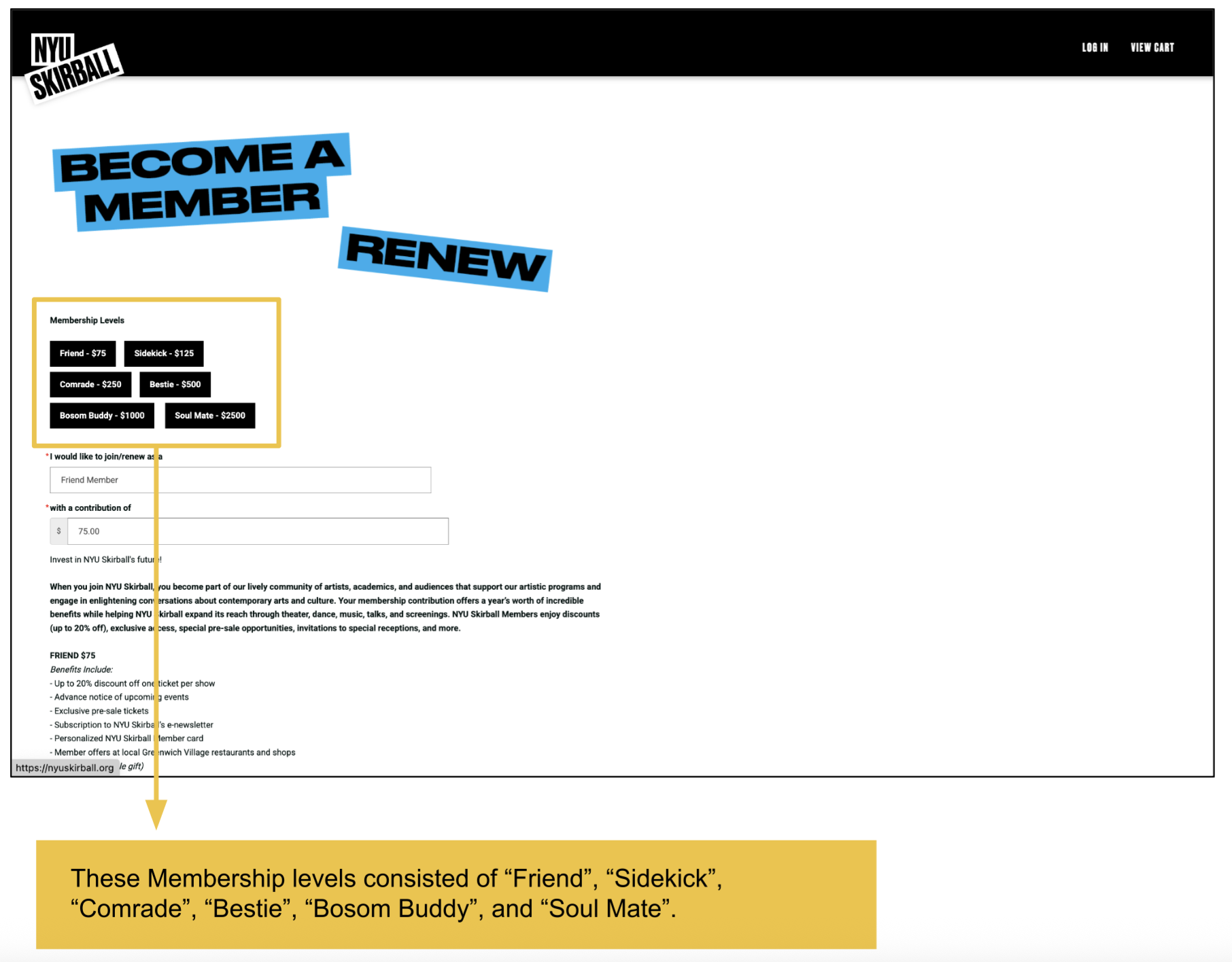
Solution
We then renamed the categories to make them easy to understand because the tier names follow widely recognized membership labels.
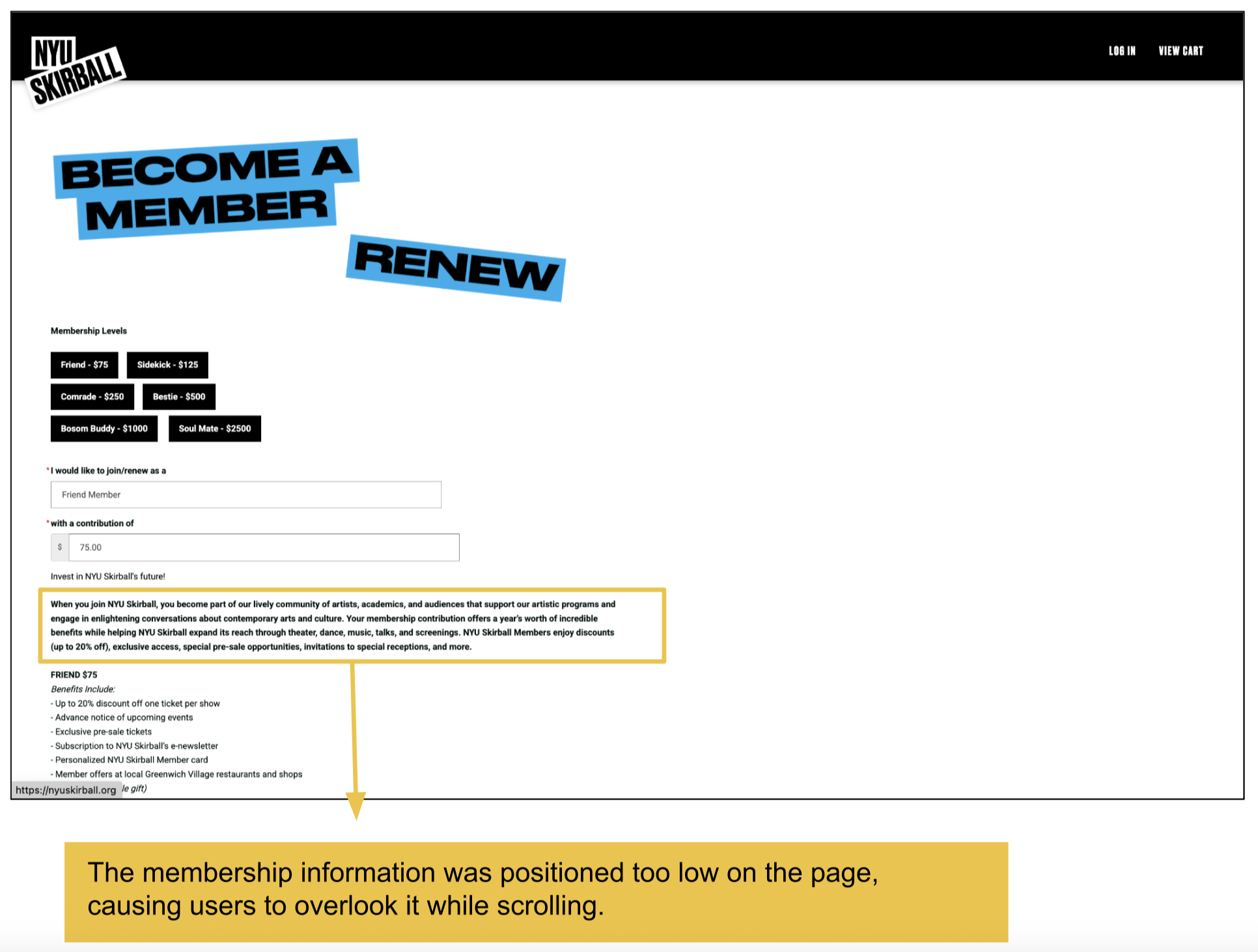
Recommendation 2: Include Membership Information throughout the check out process
“I’m not going to sign up for this just because I … just don’t know enough.”
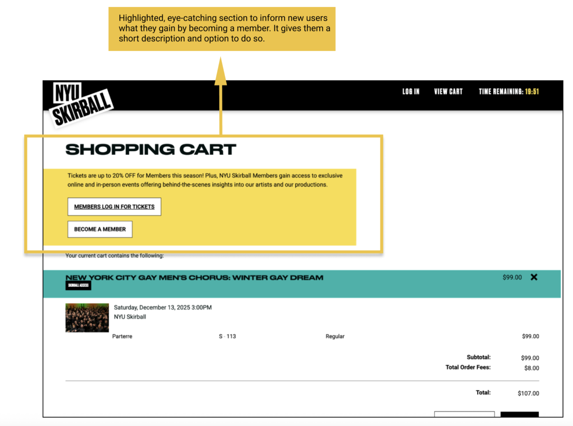
Problem
Not enough info about membership throughout the checkout process. New users won’t be able to learn about what the membership can offer them. Missed opportunity to attract users.
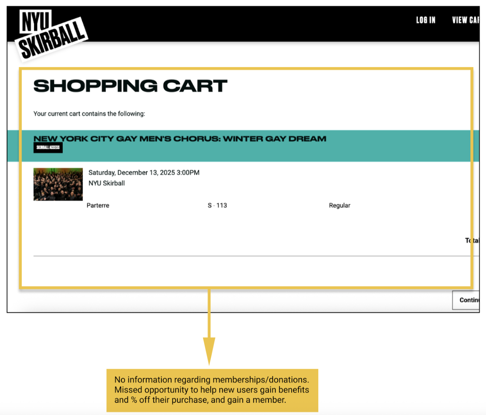
Solution
Include an eye catching section about becoming a member, and a short description about what members receive. This way new users can be introduced to the membership options- this is exactly what we have seen in our competitor research as well.
Recommendation 3: Reorganize the navigation bar
“Oh, that’s different … I didn’t expect it to be there at all … I really thought it would be under ‘About’ or ‘Explore.’”
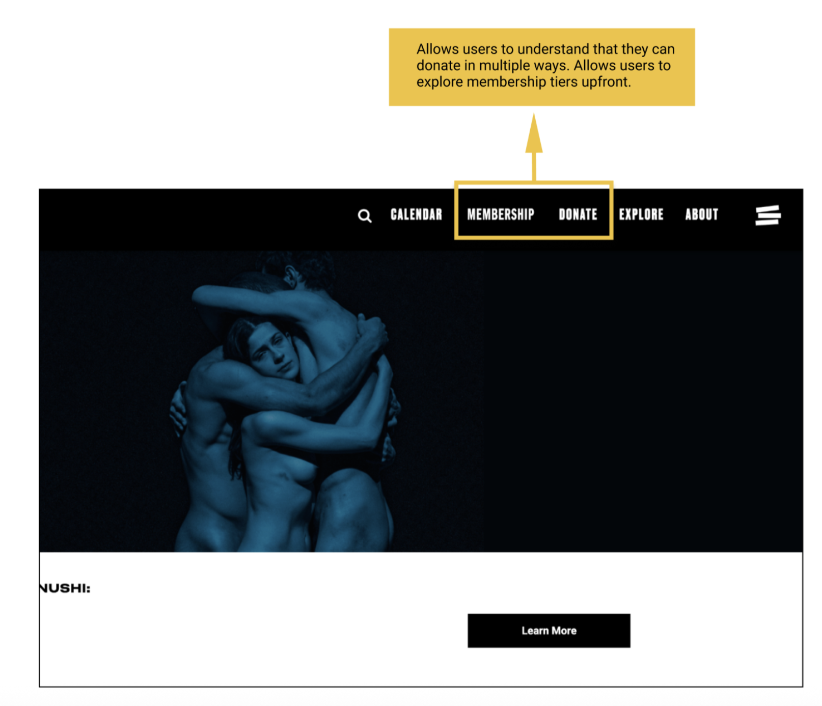
Problem
We noticed during our user testing that a lot of users had difficulty navigating the site, especially locating the membership page. Without clicking on the “Hamburger” menu icon, a lot of users thought they could find “Membership” details under “Explore.”
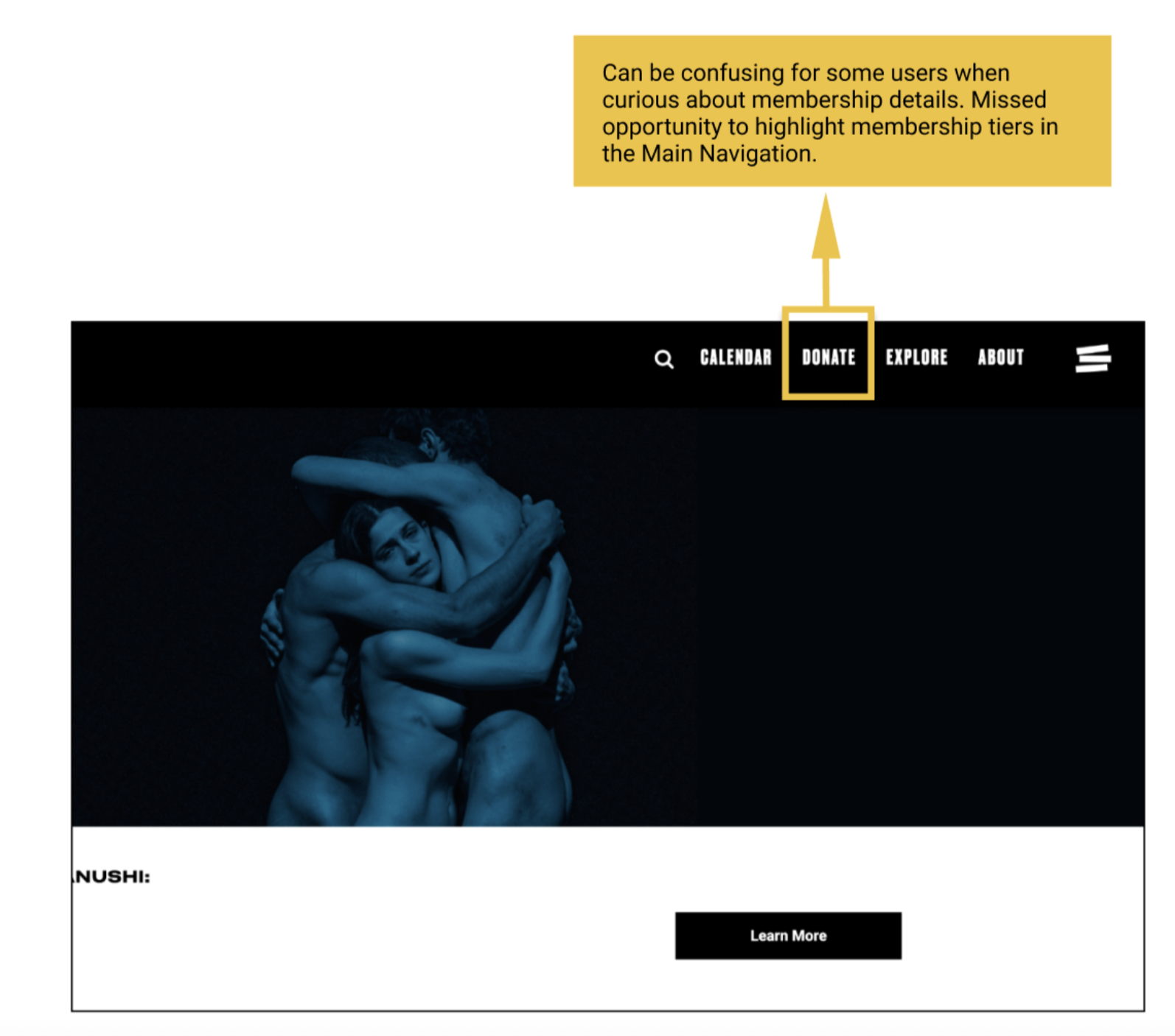
Solution
To include both “Membership,” and “Donation,” in the main navigation bar. This is something we have seen in our competitor research. This solution allows users to understand that there are different ways to become a member, and it gives them those options upfront.
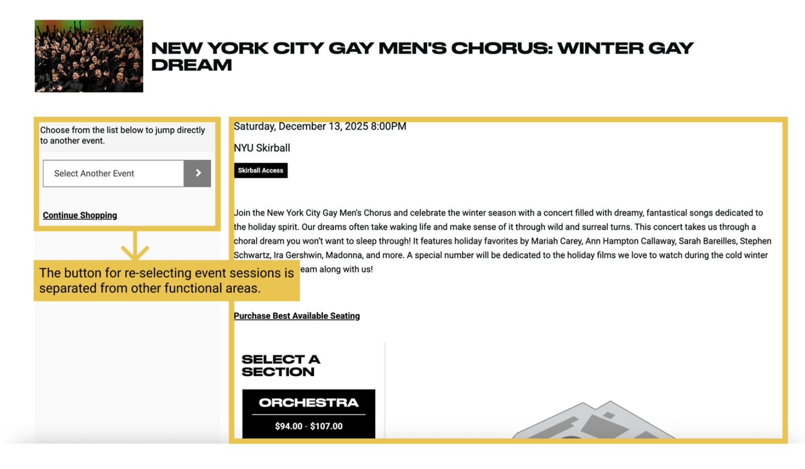
Recommendation 4: Redesign the “Select Different Events” section
“Why won’t they let me edit my seat? … That’s really inconvenient, I think I’d just quit.”
Problem
Since users are accustomed to looking at information on the right side, they often fail to notice that they can actually change the event session on the seat selection page.
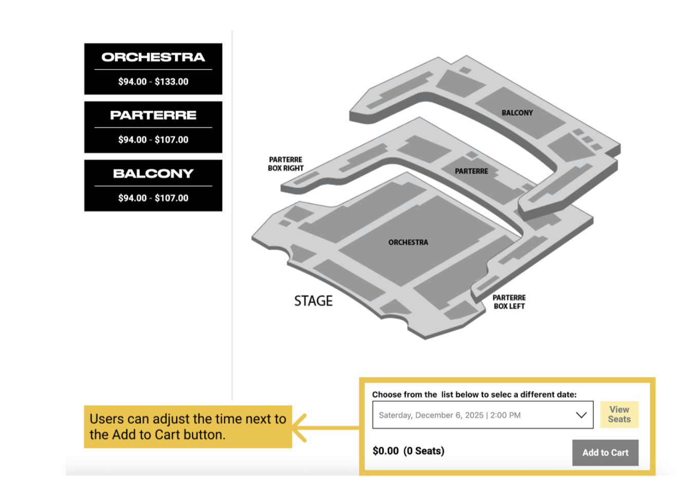
Solution
Moving it next to the Add to Cart button aligns better with user habits.
Outcome
This project was a success because we were able accomplish our research goals of developing insightful solutions to increase new user’s understanding of the check out process, membership, and donation options, all through our interviews with our participants that amplified “the voice of the user.”
The clients expressed their appreciation for the recommendations and we actually see them implementing our work into their website now: https://nyuskirball.org/ , so it’s really amazing seeing how your research makes real impacts on users.
What I learned. . .
I learned that when working with clients, sometimes their overall goal might shift throughout the project and it is important to remain open-minded and allow time to adjust to any new research they would like you to do.