Designing the STARZ mobile application
Methods: User Research, Remote Interviews, Usability Testing
Client: STARZ - Course Project
Timeline: 8 weeks, September - December 2025
Team: Elizabeth Serjantov, Zahra Hakani, Yash Wake
Tools: Figma, Google Docs, Google Slides, Zoom
What is STARZ?
STARZ is a digital marketplace shopping experience where users can access multiple live streams hosted by sellers ranging from local businesses to larger corporations. The marketplace offers the option to browse a diverse array of shoes, including vintage footwear, sneakers, designer labels, and athletic shoes.
Problem & Goal
Determining the appropriate information architecture, designing the most understandable user interface, and ensuring users could complete their goals on our mobile application.
Timeline:
Phase 1: User Research (3 weeks) → User Interviews → Affinity Diagramming → Empathy Mapping → Key Insights → Persona → Competitor Research
Phase 2: Ideation (2 weeks) → Card Sorting → Tree Testing →Information Architecture
Phase 3: Solutions (3 weeks) → Low-fidelity Prototyping → Unmoderated and Moderated User Testing → Iteration → Final Prototype
Phase 1: User Research
Research Goal: To determine general purchasing patterns and trends amongst young consumers and to identify common interactions, platforms, and technologies involved in live shopping experiences.
We began by conducting user interviews to gather crucial information from our chosen demographic about their shopping online experiences and references. Our purpose was to answer these core questions;
What do they expect in an online live shopping application?
Are their expectations met? [When navigating an online live shopping marketplace]
Demographics
In total we recruited 5 interview participants that matched our target users.
Interview Protocol: Gather what users want, expect, and need.
Interview Format: Remote interview over Zoom
-
We started by making participants feel comfortable and informed, explaining the product, & asking for consent to record.
-
We asked basic questions to get a better understanding of our user and their experiences with live shopping marketplaces.
-
Here were the most important questions of our interview, covering what features users expected, and what positive/negative experiences they had that could influence our application.
-
We wrapped up our interview and gave our participants a chance to sum up their responses and provide us with any questions.
We also created a survey to potentially email out to participants that allowed users to answer questions based on a scale system.
Results
Once we finished our interviews, we were left with a wealth of data that needed to be understood and displayed in a way that helped others see what we had learned. We decided to break down the insights we received from our interviewees into an Affinity Diagram and an Empathy Map:
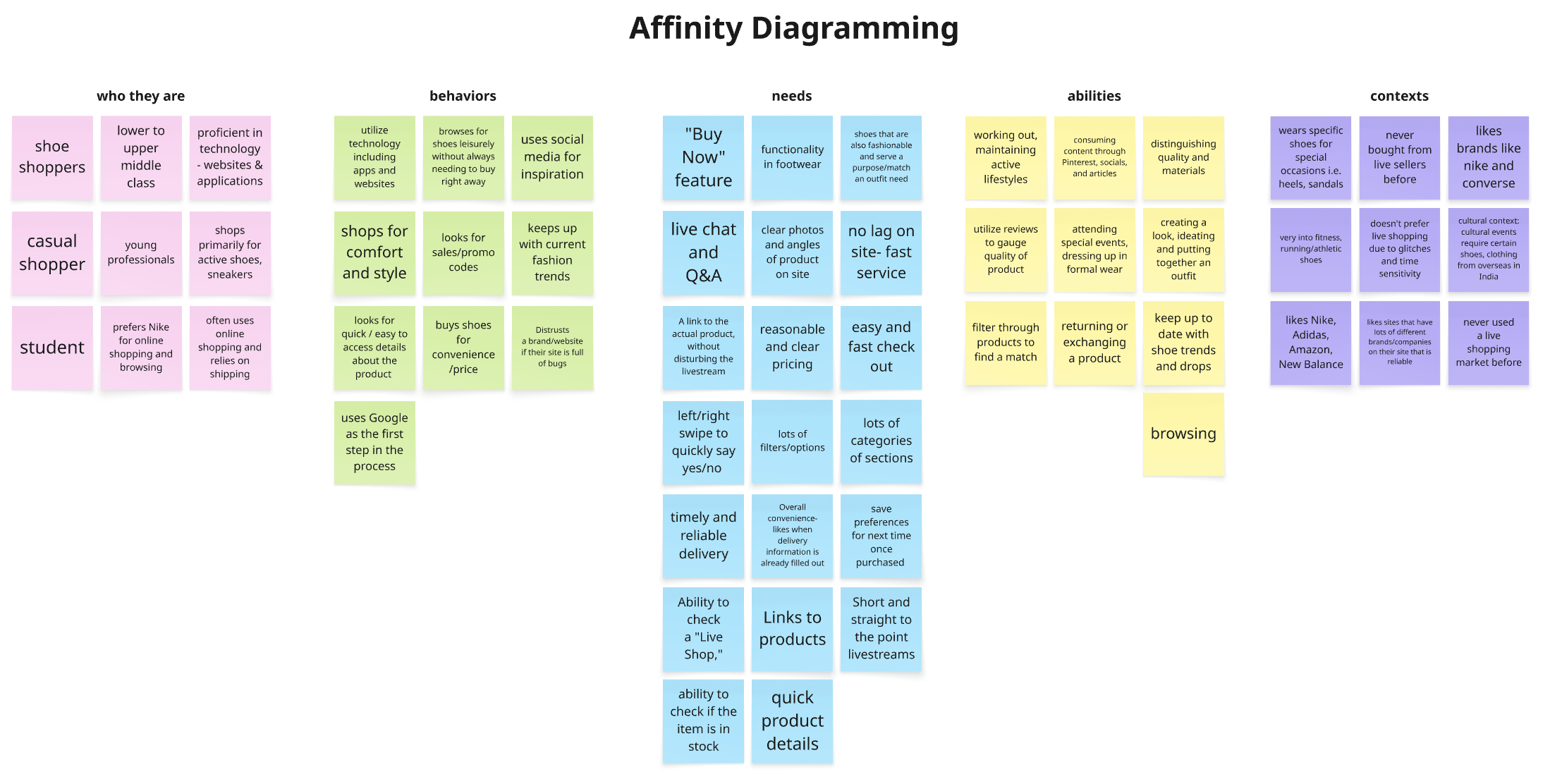
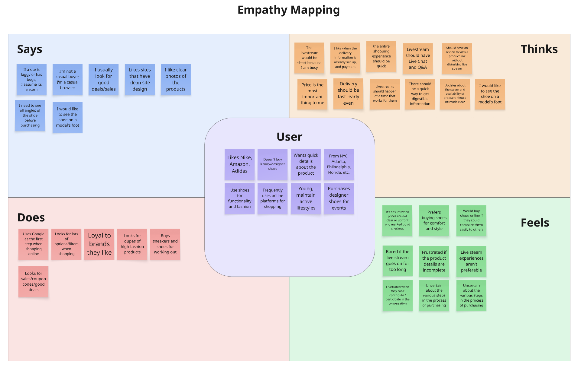
Key Insights from these methods:
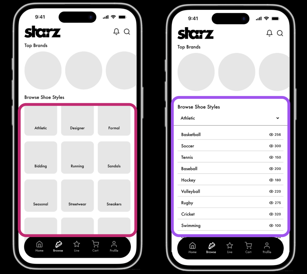
Users need a clear, neat site that is full of filters and categories to appeal to each user’s unique style. Each user has a unique taste- some want athletic running shoes, while others want stylish, designer everyday sneakers. The categories on the site must offer all options.
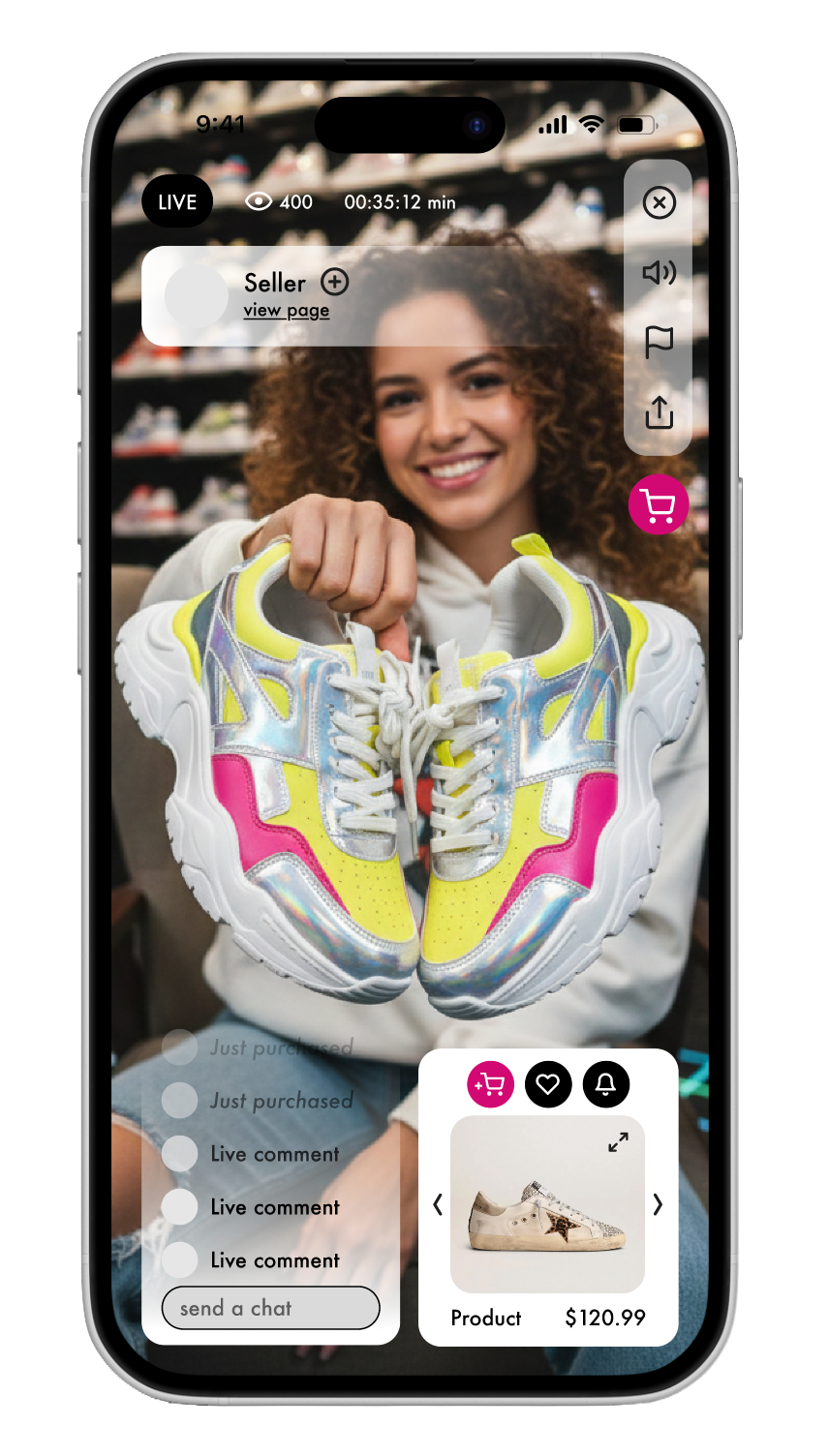
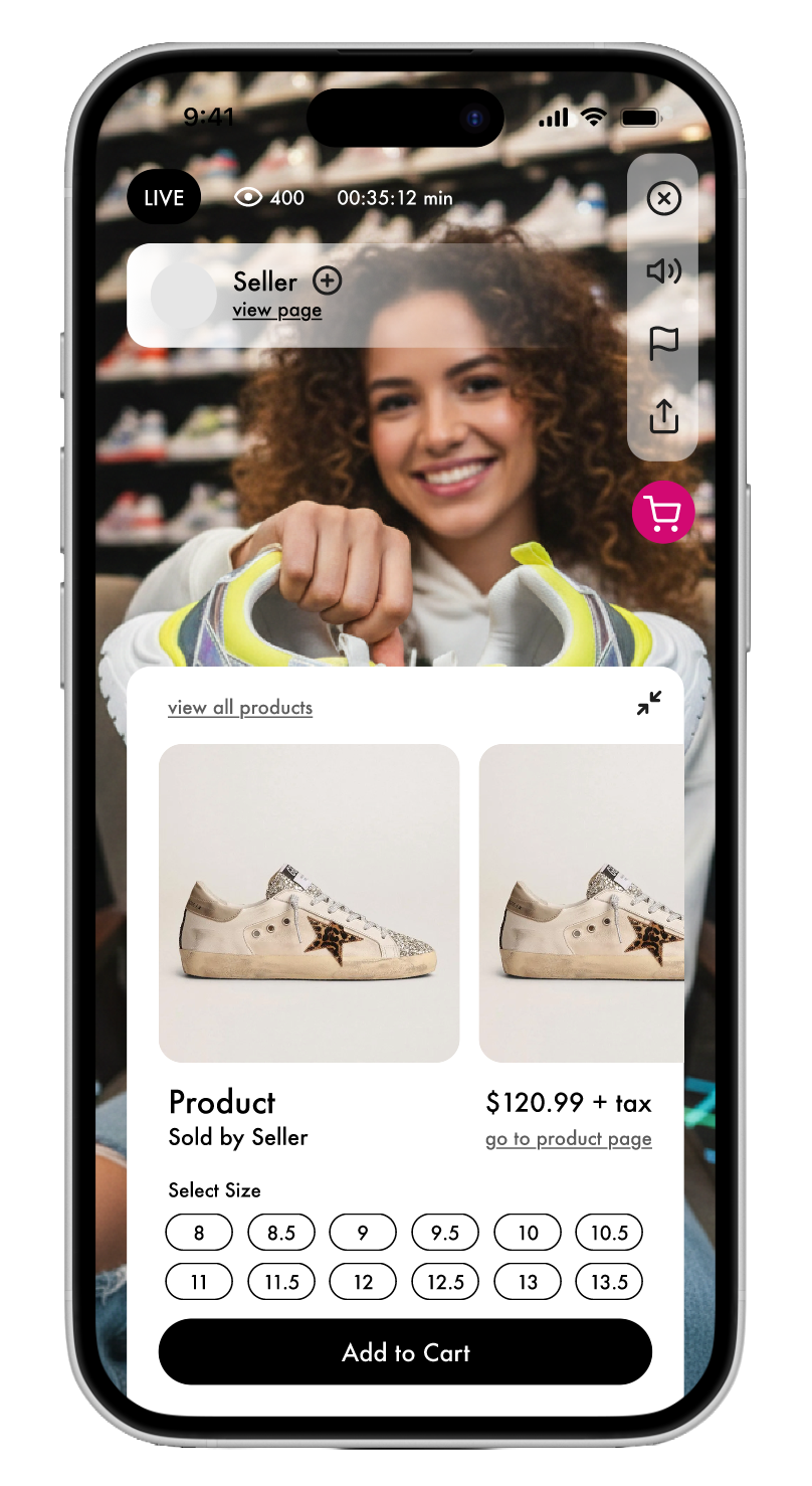
Users expect livestreams to allow them to engage in live chat, ask questions, view multiple new products, and access more information about the shown products easily. Users want to be able to access the link to the footwear being shown in a live shopping experience without disturbing the livestream. They also want to be able to compare options
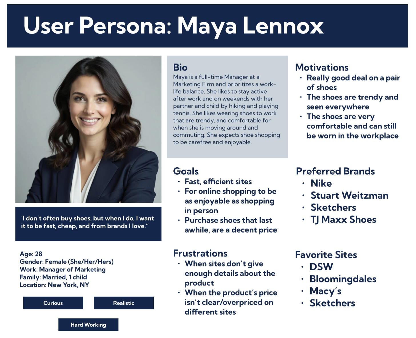
Persona: Our Finalized Look at Our Users
I created the user persona “Maya Lennox,” which encapsulated all of our core insights to reference. Now we have a clear picture of our users. Now we can move to ideation of the application layout.
To identify industry best practices, gaps, and opportunities that could inform a more intuitive and competitive user experience. This will help us when we create our card sorting & tree testing studies.
Gen Z, Millennial
High/Middle Technology Experience
Lower to Upper Middle Class
Location: United States
Buyers on the application

What problems do they face? [When navigating an online live shopping user experience]
What are the positives and negatives about the entire online live shopping experience?
Users don’t want to waste their time. Already, users are iffy about shopping online and need to trust the livestream, the host, the price, and the brands. They want fast service and delivery. Users like when they are able to save their information, and favorite brands/styles while shopping.
Users are looking for a good deal. They want to know why they should own a certain product, if there are any discounts, and if it suits their needs. Consider using a host/brand that a user trusts.
Competitor Research: For IA Inspiration
Research Goals
To evaluate competitor applications across five categories:
Home Page
Navigation
Organization
Appearance
Mobile-Friendliness
Phase 2: Ideation
Card Sorting & Tree Testing: To Determine IA
Card Sorting: Users are tasked with sorting a series of cards that have common live-shopping and shoe-related labels. This helps us understand how users categorize and organize important information.
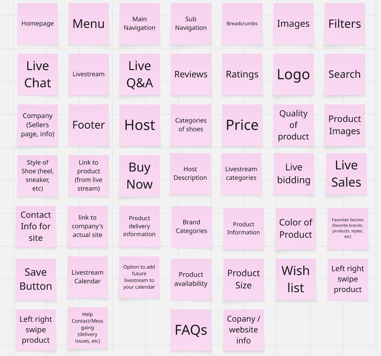
Card Sorting Insights
-
Many users grouped live shopping and bidding categories within the same umbrella, including live chat and Q&A.
-
Users grouped product images with various categories including pricing, sizing, order details, and even shipping information.
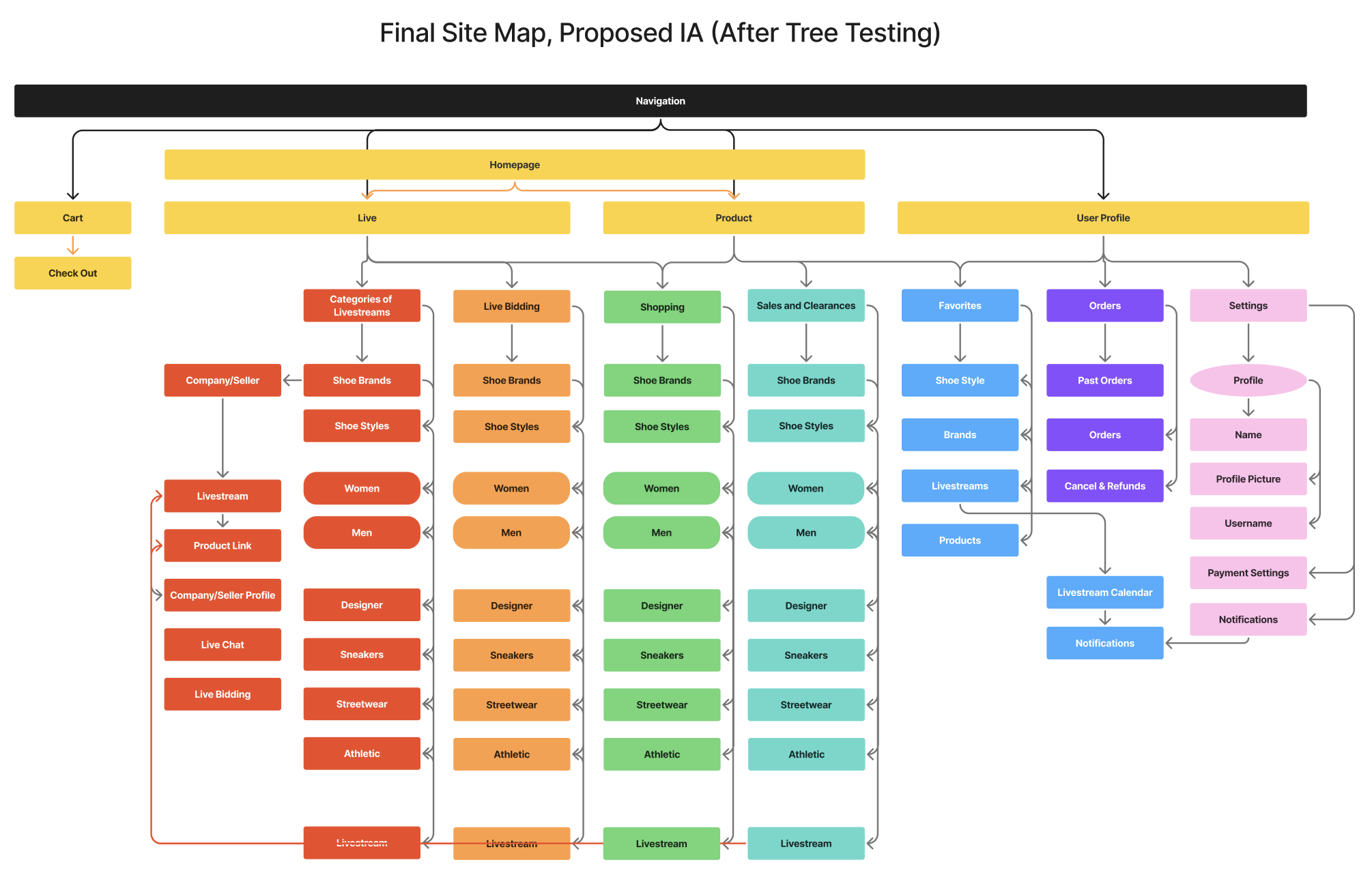
Information Architecture, based on these insights:
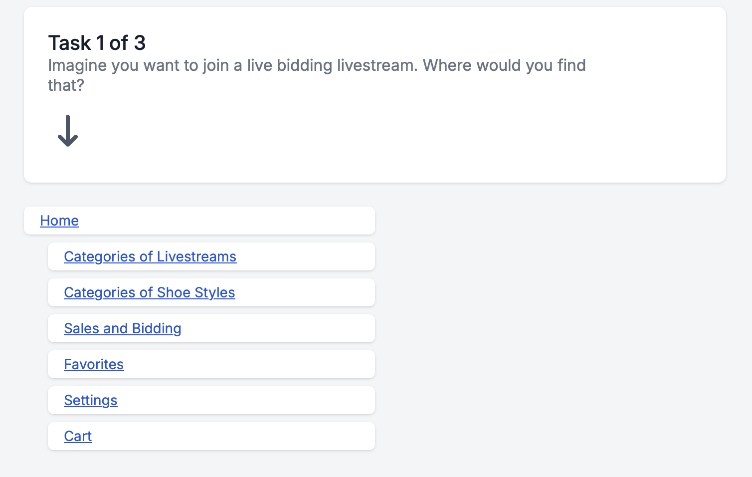
Tree Testing: Over nine participants were provided with three tasks that focused on evaluating our proposed navigation system. We observed these tasks to see if users were able to complete them.
Tree Testing Insights
-
Users expressed the need for one simplified and straight forward navigation system that categorized the available options and information into a few categories.
-
Users expressed the need for filters and categories across all initial categorizations and preferred to access information through a series of well-organized and intuitive actions rather than having them all upfront.
Phase 3: Solutions
Moderated/Unmoderated Remote User Testing: To test our first prototype
From our research and testing, we designed a low-fidelity prototype to carry out 3 tasks. We conducted moderated and unmoderated testing with 6 individuals to assess discrepancies in the design and opportunities for changes that could make these task flows more intuitive.
Recruited 6 participants for 3 moderated, 3 unmoderated remote user tests
→
Key Insights from Testing
-
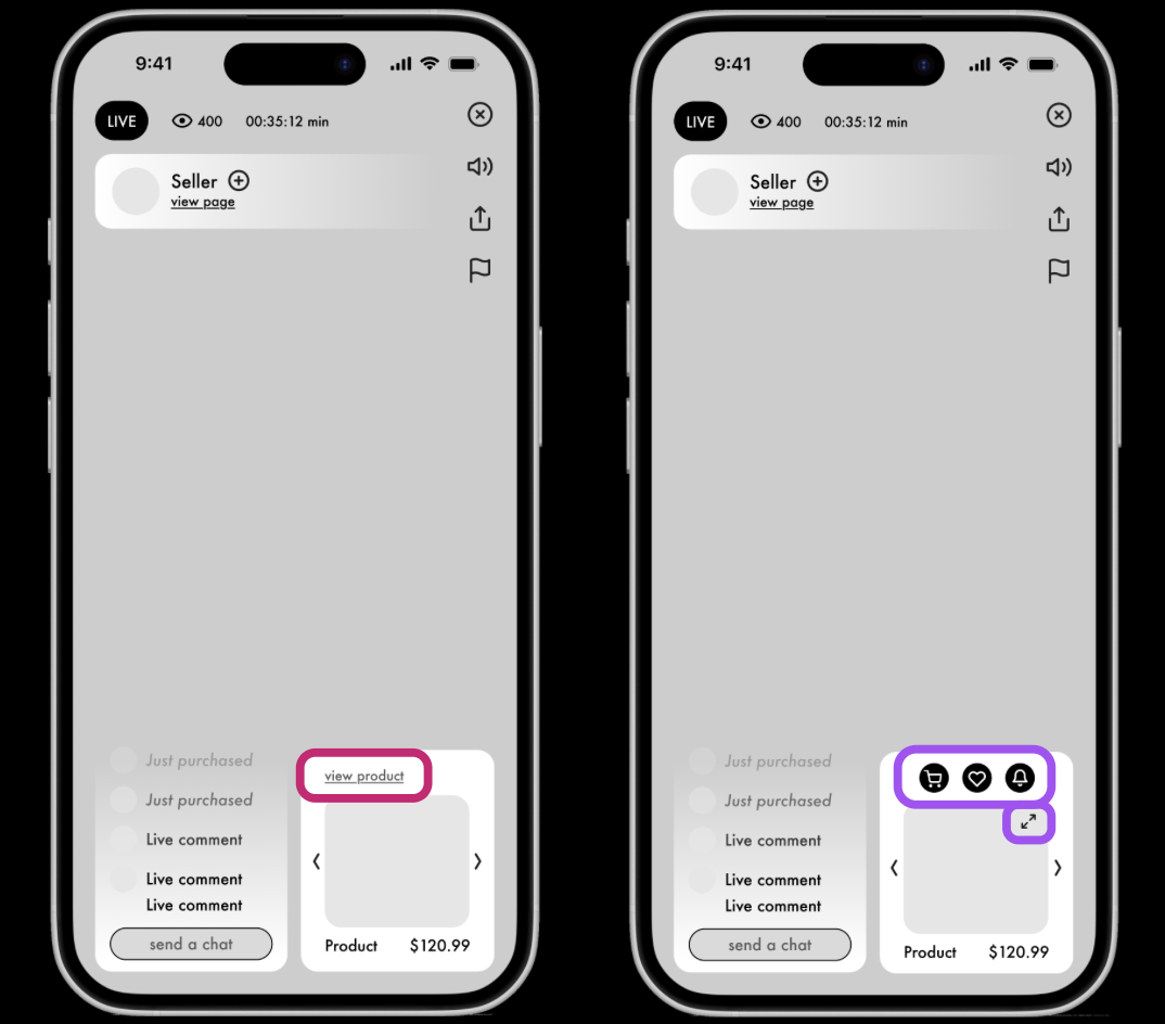
Users felt there should be a more intuitive way to interact with the product, without having to tap the view product link.
Gave the participants three tasks to complete on our low fidelity prototypes, and observed their actions as they spoke their process aloud.
-
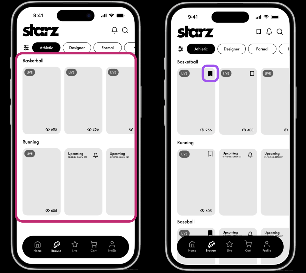
The prototype didn’t provide an option to save livestreams. Once the user clicked on one, they wouldn’t be able to go back and easily find it again.
→
Examined insights from each task to develop key insights
-
Users felt like there was a slower and longer navigation process in browsing through categories.
Final Prototype
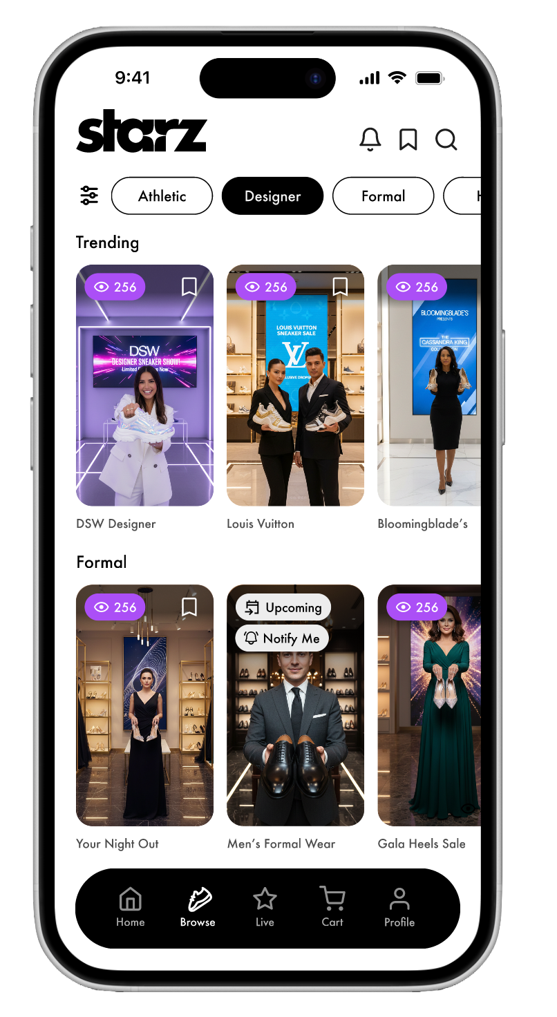
Was the overall goal met? Yes.
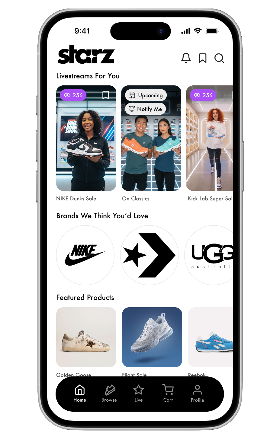
Our final prototype, reflects the insights we gathered from user research, ideation methodologies, and usability testing we conducted on participants. This final prototype is a success because it was built and proven by detailed research that it allows users to have the ultimate shoe-shopping experience.
What I learned. . .
I learned that sometimes, what you believe is the best design choice can be given a whole new perspective by users. It is essential to remain open-minded when researching or designing, so you can empathize and make user-centered decisions.