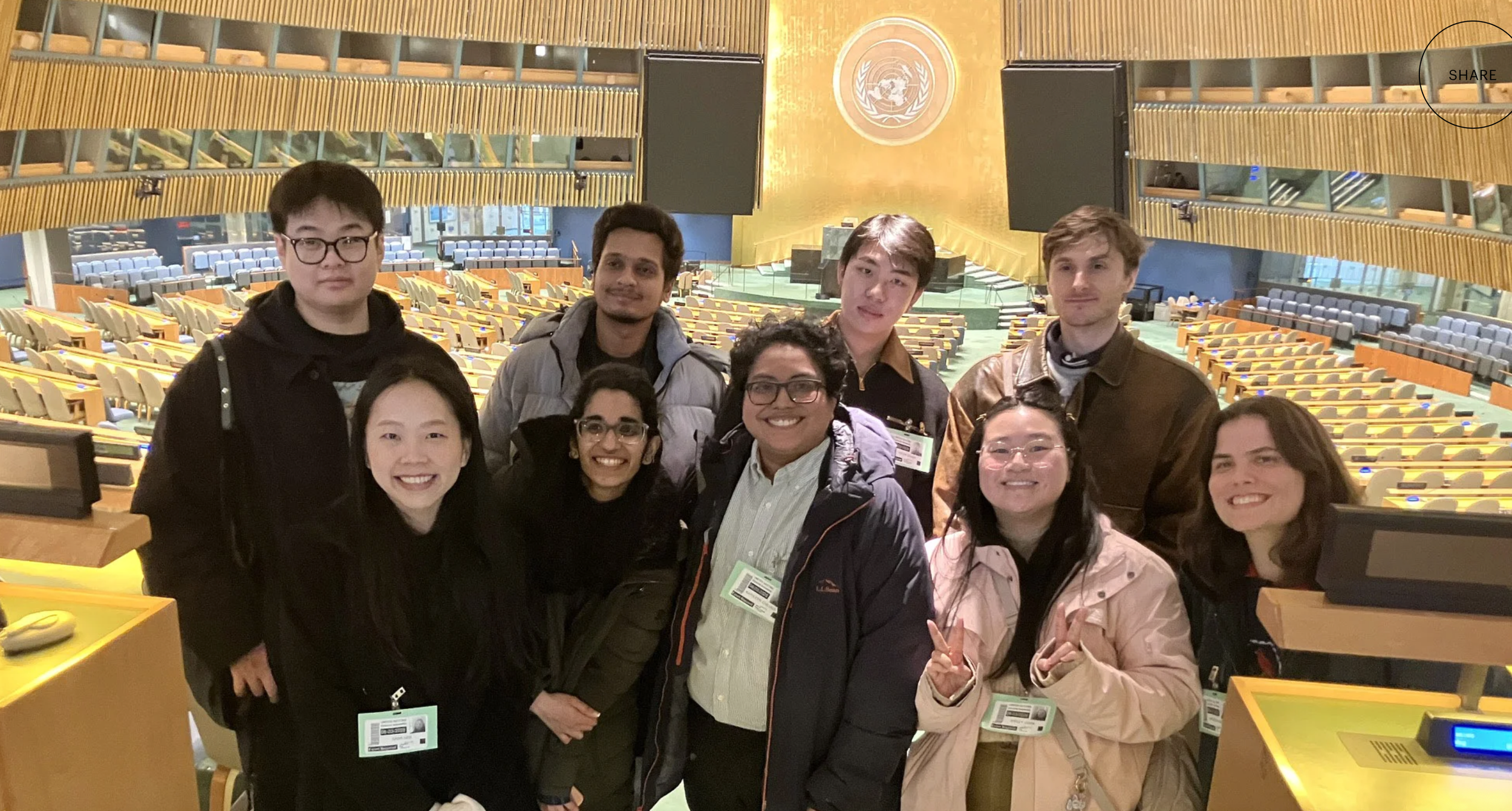
Using eye-tracking technology to identify usability issues, and then designing to solve these problems.
Methods: Eye-Tracking Sessions, SUS Questionnaire, RTA
Client: United Nations Digital Library | https://digitallibrary.un.org
Timeline: 14 weeks (February – May 2026)
Team: Elizabeth Serjantov, Roshni Ganesh, Vasilios Nikolopoulos
Tools: Figma, Usertesting, Tobii Eye Tracker, Zoom, Google Survey
What is the United Nations Digital Library?
The UN Digital Library (digitallibrary.un.org) is designed to provide global public access to UN documents and knowledge resources. While the platform is intended for broad use by a global citizenry, it often requires specialized knowledge for users to access what they need.
The Process
To solve this problem of discovering specific usability issues, we developed and underwent the research plan below.
Research Plan: (https://docs.google.com/document/d/1Uy4FgnP0yzKZVfmM1d6Vc-Zb7tgfdDpyynUaLM_Ss44/edit?usp=sharing)
Designing the Eye-Tracking Study
Results of the Study- What was working?
Another feature that worked well on the site was locating the Contact Form, which users could use to submit questions to a librarian when the Live Chat feature was offline. Once again, 2/2 of my participants were able to locate this feature and explain in detail how it could help them answer a question. A quote from Participant 4 expressed: “I knew exactly where to go once it said the Chat was offline. Once you clicked ‘Ask Us,’ you were presented with two options- and the Contact Form was clearly the next step you would take.”
The last feature we recognized that was working well was the content in the “Help” section and the “Search Tips” tool. Users appreciated the amount of information available on these pages. Unfortunately, 0/2 of my participants were able to locate the Search Tips tool (a key finding I dive into later), and 0/2 used the Help page to improve their searches. My team members found that their participants found the information useful for independent searching.
SUS Questionnaire (System Usability Scale)
Key Findings
Recommend Actionable Usability Improvements
Finding 1: The Search Tips is very hard to locate or mostly invisible to users.
Supporting Claim 1: 0/6 participants found the Search Tips on the first go for the intended task and expected it to be somewhere closer to the “Search Bar”
A direct quote from one of my participants: “No… I did not realize that was there. Why did they put it in such a small font? I would have never noticed- it looks like it’s not important.” (P4)
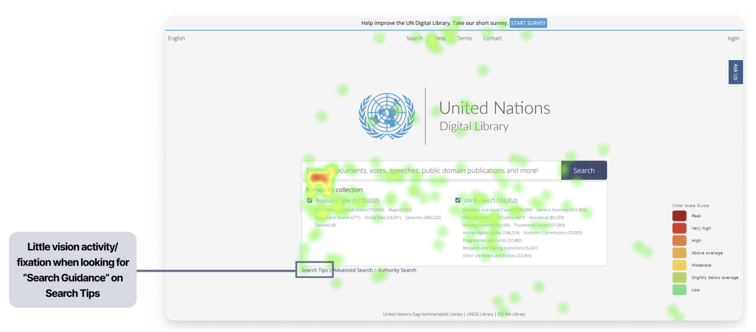
We can see evidence of this low visibility in this Static Heat Map to the right.
Supporting Claim 2: 0/6 Participants did not understand how Search Tips was different from Advanced Search and how it could help them
A direct quote from one of my participants: “I saw a lot of different filtering options- I guess I could use Advanced Search for this task (referring to a task that was supposed to have them locate and use the Search Tips)” (P1). Along with this quote and others, my team members found that it showed clear confusion about which resources were available to users locating documents, and what the different tools do.
Recommendation 1:
Current State of the UN Digital Library Homepage:
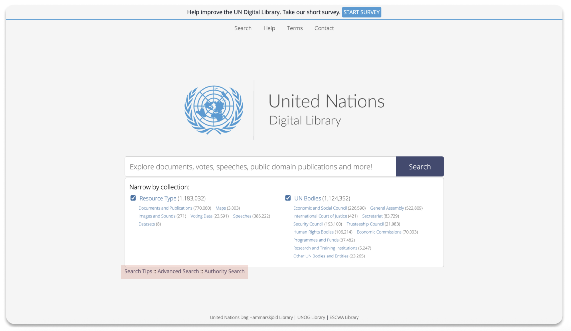
The Search Tips resource is located below the Search Bar. Currently, the Search Tips is small, provides no evidence that clicking it would give feedback, and is not emphasized as an important and helpful resource if users need it.
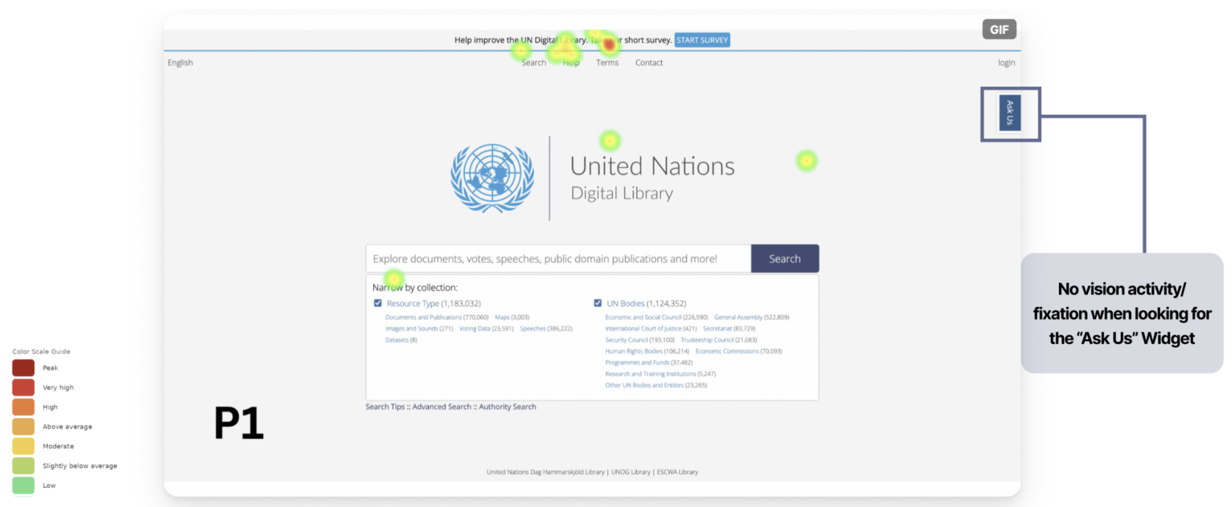
Finding 2: The “Ask Us” widget was not immediately discoverable, requiring users to actively search for it rather than naturally noticing it.
Supporting Claim 1: 4/6 participants took an average of 17.25 secs to Find the “Ask Us” Widget. 1 participant took >1min to Find the “Ask Us” Widget. 1 participant did not notice the widget at all.
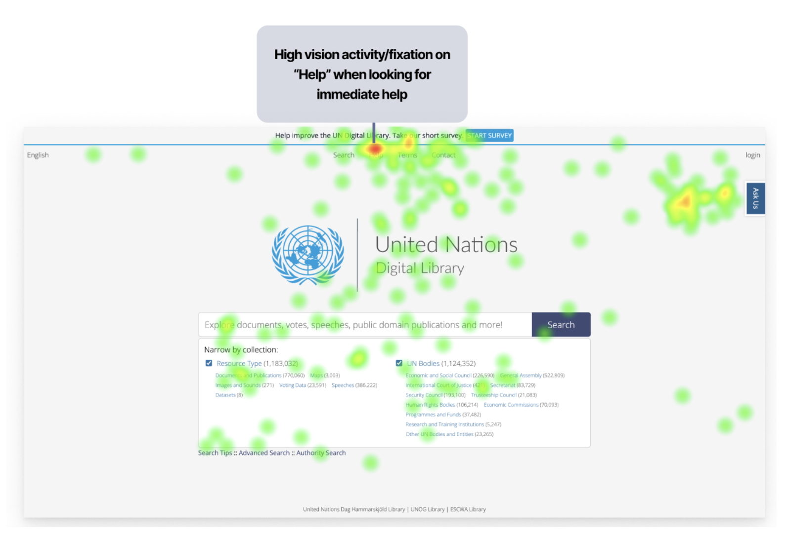
We can see this in the Heat Map my team member collected below from one of my participants (P1) (to the right- current state of website):
Supporting Claim 2: Participants were confused by the Chat Online Hours, as the posted opening hours on the “Contact Form Page” referred to the Library overall rather than the chat service specifically. 1/2 of my participants struggled to locate the Chat Hours, and when they did, they still were not certain it was the correct information.
A direct quote from one of my participants: ” [Locating the Online Chat Hours when the chat was offline] . . . Made me feel discouraged.” (P1)
Recommendation 2: Proposed Redesigns
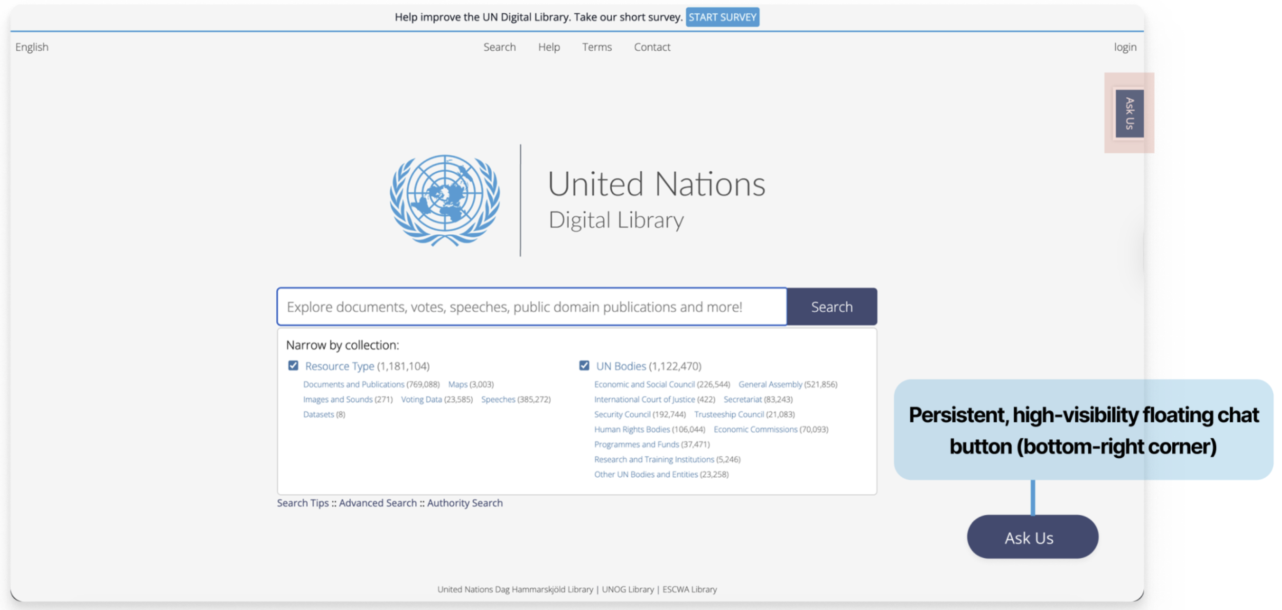
This redesign removes the “Ask Us,” label from the top-right of the home screen and places it in a location that matches what users expect when seeking a Live Chat resource.
Finding 3: Users’ Mental Model of what information “Help” on Top Nav should contain did not match the existing information present
4/6 of our participants expressed confusion when navigating the “Help,” page, although 6/6 located this resource. Some evidence of this was direct quotes from both of my participants:
“Yes I noticed help, but it was not that helpful.” (P4)
“Options to contact, help with finding documents. It was not what I expected.” (P1)
Problem & Goal
As part of ongoing efforts to improve the public-facing interface, the Library team has requested external research and usability testing to evaluate the current Help and Support ecosystem and recommend usability improvements.
Our primary goal is to study… How users navigate the Help and Support ecosystem on the UN Digital Library, and where friction occurs in their attempts to find help.
Because we want to find out… What users expect when seeking support, and where the breakdown between their intent and the interface occurs.
So that… We can identify what should be changed or simplified to reduce confusion and make help easier to find.
We chose eye-tracking as our primary research method because it helped us answer our primary research focus- where do users expect to find help and support, what information matters most, and how visible are the Help and Support systems to users? Eye-tracking sessions would yield gaze plots and heat maps that reveal how users interact with the site and where they look first/the most.
Tasks and Scenarios: (https://docs.google.com/document/d/1p-r539ZblP-5lMGGKnRD36Pr-_1JZayoVGUz-09XWTI/edit?usp=sharing)
During my Eye-Tracking sessions, 2/2 of my participants recognized the “Help” label in the Main Navigation. They trusted it as the most reliable source of relevant information, alongside the “Ask Us” label, which directed participants to the Live Chat feature. My team members found similar insights, and we agreed it worked well on the site.
We recognized this in our Static Heat Map of the Homepage (image seen to the right). (Heat Map (Red= More time spent, green= less time spent)).
Our Research Questions were:
What do users expect when seeking help on the UN Digital Library?
How visible and understandable are the Help pathways? (Focus: Chat, Search Tips, Contact and Help)
What information matters most to users when they seek help?
Participants Demographics:
6 Participants (each of us recruited 2 participants)
Age Median: 25-44
Majority (4/6) used a Digital Library website once a week or month
Screener Survey and Consent Form: (https://docs.google.com/document/d/1kbFbhvrM7pppJNrHQroLVc8gnwdJb28hoqypFx_sRsg/edit?usp=sharing)
Within our research process we asked our participants to complete a post-test questionnaire containing 10 different questions with a 5-point Likert scale that helps evaluate the usability and learnability of a system.
The SUS Score of the United Nations Digital Library Help and Support Systems was 39.6, with a benchmark score of 68.
SUS Score Calculator: (https://docs.google.com/spreadsheets/d/1v3xPA2Dwj9C8zhCyZZw0dsz2AvnwDkqFHc3_Lgi2w18/edit?usp=sharing)
SUS Survey: (https://docs.google.com/forms/d/17Stqd24S24BXUAAo2E4hpw3314TJHg83Bg9C936oC3Y/preview?edit_requested=true)
SUS Responses: (https://docs.google.com/spreadsheets/d/1D_zXAthY6AhyUf_kAn_ZKuP5hKPLcSFEDjHW8uZ5byw/edit?gid=954979312#gid=954979312)
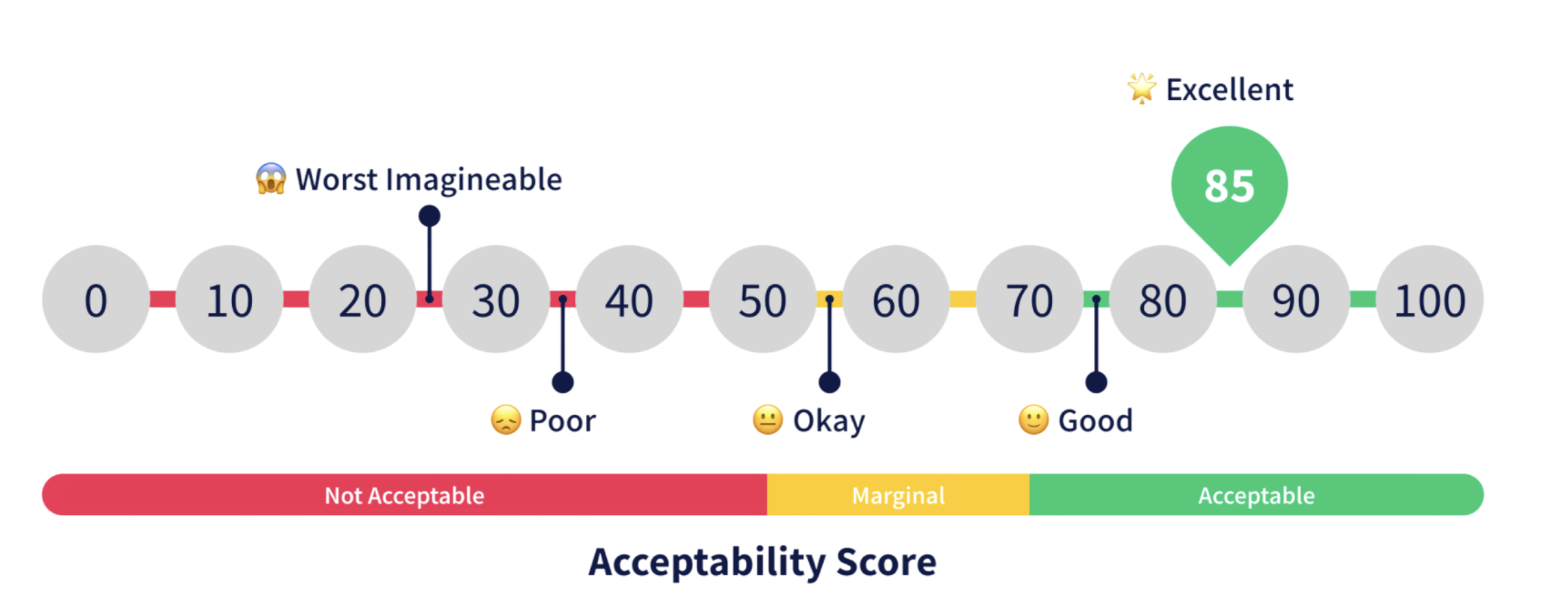
SUS Scoring
The UN Digital Library site had “Poor,” scoring, based on what our participants had input. The results of this survey validate our hypothesis that there were many usability and learnability issues within the Help and Support Systems.
Each person in our team focused on one help and support feature that had a usability issue uncovered by our individual eye-tracking sessions.
From my eye-tracking sessions, there was one task where I felt strongly that my participants struggled the most on: “You’re unsure which result is correct. Find any guidance on the site that helps you search better. (Success Criteria Eye-Tracking Focus Finds Search Tips independently (or) Use Help on Navigation First fixation point; path from search bar).”
0/2 of my participants located the Search Tips tool, and when I asked them about this, 0/2 of them even realized that this tool was accessible.
A direct quote from one of participants (P4): “I did not see that at all [the Search Tips].”
This was highly concerning because the Search Tips tool is a crucial part of the UN Digital Libraries’ Help and Support System. It helps users refine their searches to locate specific documents, greatly reducing the time they spend finding them.
This brings us to our first finding: The Search Tips is very hard to locate or mostly invisible to users. I focused directly on this finding, and developed a potential A/B Test (https://www.figma.com/deck/jNcys0vCnx7iDYtbdmmBeW) to further validate this usability issue.
My team members focused on the next two findings:
2. The “Ask Us” widget was not immediately discoverable, requiring users to actively search for it rather than naturally noticing it
3. Users’ Mental Model of what information “Help” on Top Nav should contain did not match the existing information present
To view each of our participants responses to each task, and recognize patterns in usability issues, we created a Rainbow Sheet, linked here: https://docs.google.com/spreadsheets/d/1kYAst_mCb2FNu5RjzqQa0hbhVZknzq_O4bNwqAExeBs/edit?gid=4#gid=4 .
Proposed Redesign:
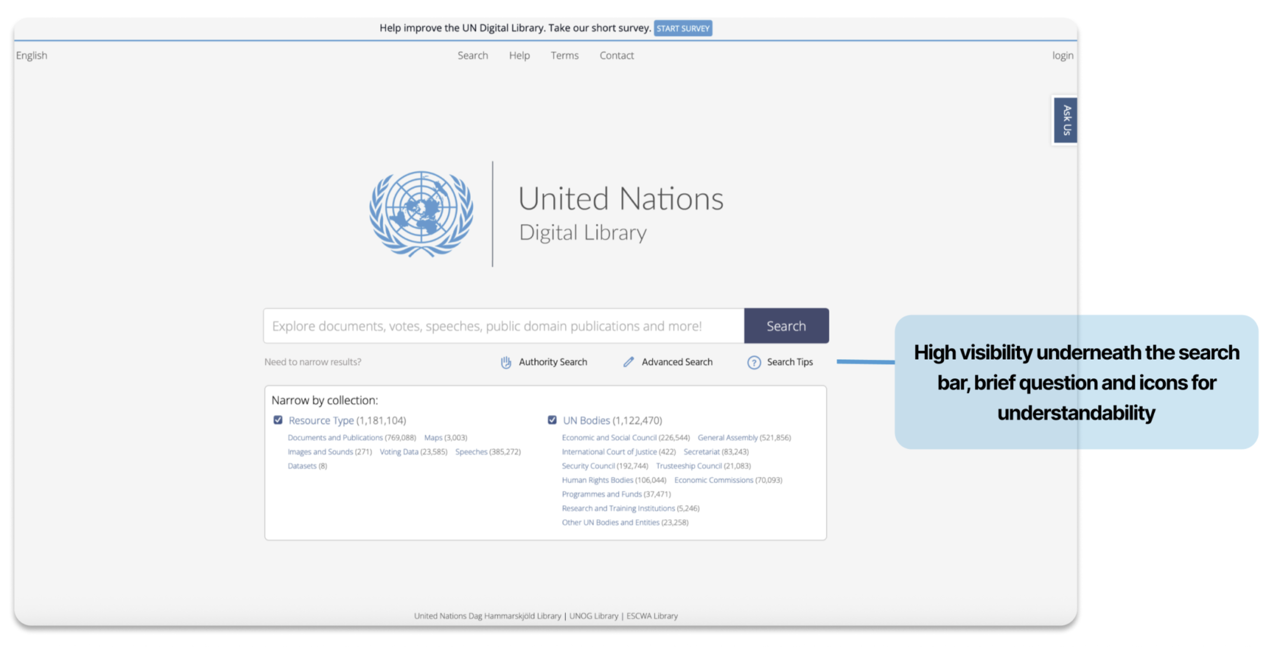
This mockup addresses the problems we discovered by making the Search Tips more visible to users: it’s larger, indicates it is clickable, and aligns with the design of other elements to emphasize its importance.
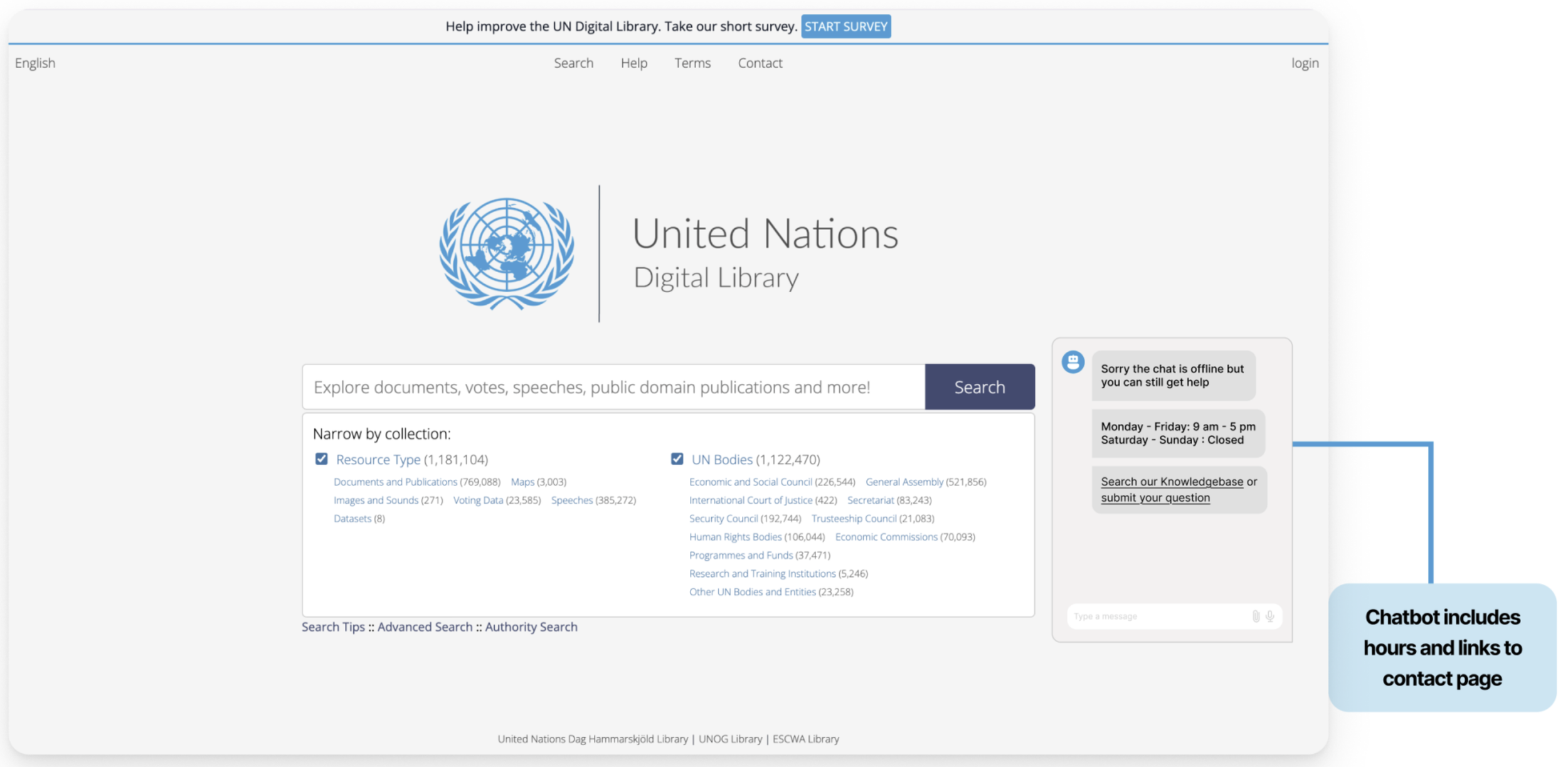
The chat appears right on the Homepage and is intuitive for users to seek help. It clearly lists the dates and time the chat will be online. Therefore my participant would not have been unsure about the Chat Hours, but confident that they found the correct information.

Recommendation 3:
Current State of the Help Page:
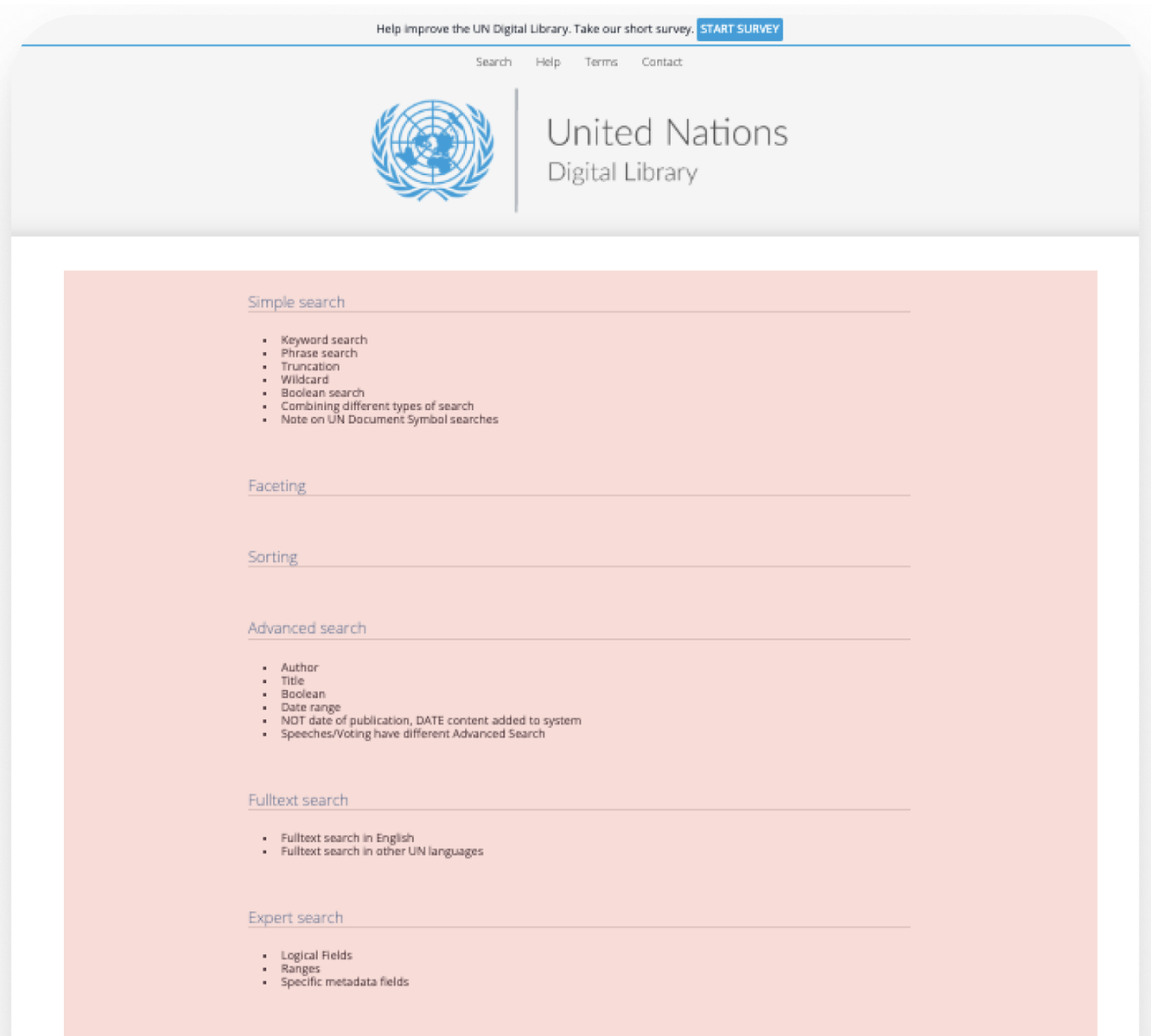
The current Help page is scattered, and requires the user to examine each section carefully, increasing their mental load.
Conclusion
Once we completed our research and developed our design recommendations, we put together a final presentation in a slide deck to share our findings and proposed redesigns with our clients. Our clients were very impressed with our research and recommendations; the only questions they had were regarding the specific tasks we had users complete in our eye-tracking sessions. We made sure to include these scenarios and tasks in our follow-up email to our client, where we sent them all of our final deliverables. I curated this email personally and ensured it included all the correct files.
Working within my team at the United Nations Digital Library was truly an amazing experience. I learned a lot about what it means to work within a team and how to understand the diverse users of the United Nations Digital Library website. It was a challenge to create an interview protocol that focused directly on the Help and Support Systems. However, through group collaboration and extensive editing, we successfully developed a testing protocol that helped us uncover crucial areas of the help and support systems that needed immediate attention. Overall, I learned how important it is to work together to recognize patterns and develop actionable solutions.
Proposed Redesign:
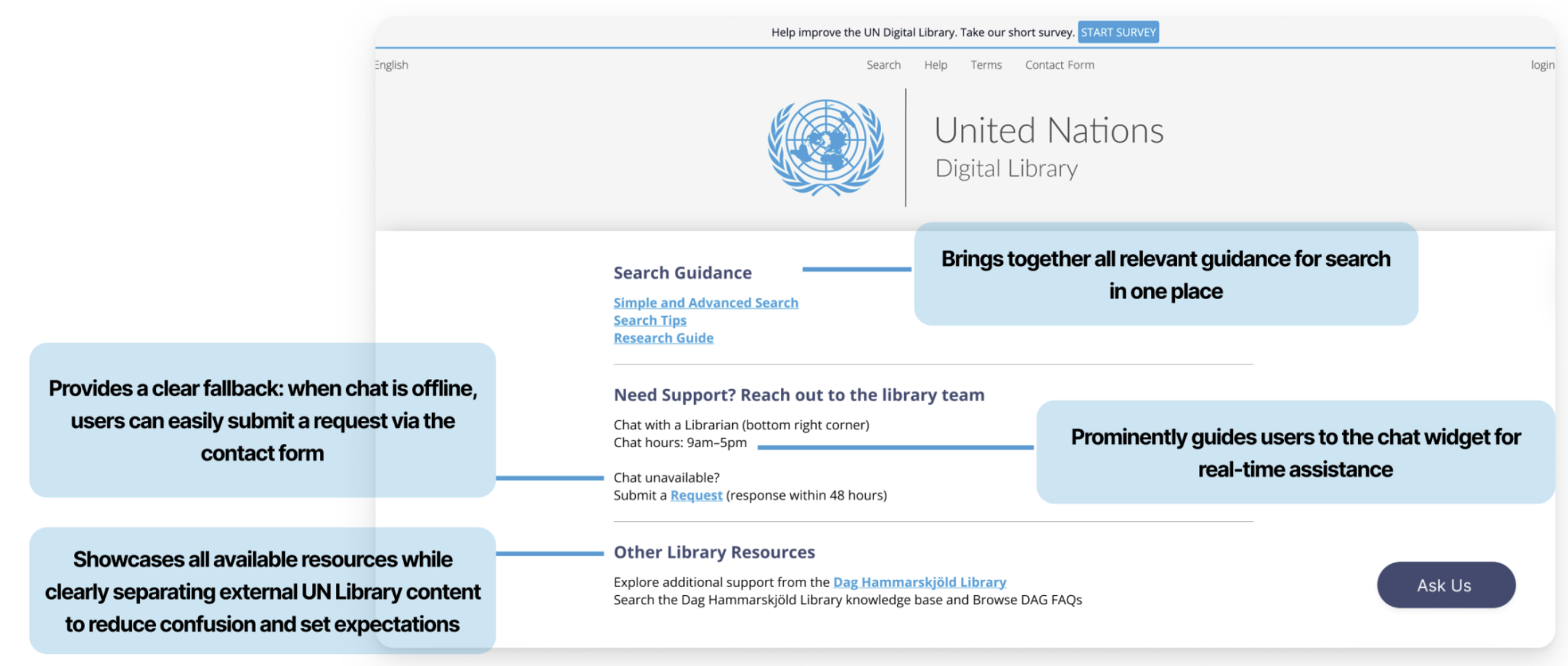
The Help page is much more understandable and gives users easy access to resources they need.